
IDF Gaza Evacuation Map
A quick post about the Israeli Defene Force (IDF)’s interactive evacuation map for Gaza. The map was posted online in early Dec. 2023 as the IDF’s horrific attacks on Palestinians in Gaza resumed after the end of the ceasefire.
Before beginning, some quick disclaimers: I don’t have any proprietary information about the map, only what’s been posted online. But given that I’ve written a book about digital maps in Palestine and Israel, I thought it’d be worth sharing what can be learned from an initial analysis of the publicly available information. This post contains a lot of ‘coulds’ and ‘maybes’ because as an outside researcher I can only lay out possible options for many of these situations. To know what actually happened, or what the reasoning actually was, you’d have to ask the relevant officials. So keep in mind this is just my personal opinion as an educated outsider, and that no one I discuss or link to here has any knowledge of, or bears any connection to or responsibility for, this post.
Also know that I’ve linked to the sources in the images, with the exception of the evacuation map itself because I don’t relish linking to the IDF although there is a link to the map in the CNN article about the map (click on the first image below).
Lastly, I was barely able to find time to write this, which means that sadly it doesn’t have alternate text for those who need it. I have trouble describing maps aside from either the vague/obvious “a map of Gaza with blue borders showing evacuation zones” or the far too detailed paragraphs I sometimes put in my alternate text on social media. So perhaps this indicates that cartography needs a longer reckoning to develop conventions for alternate text for maps. In any case, I’ve tried to be as descriptive as possible in the text below in case that is at least helpful.

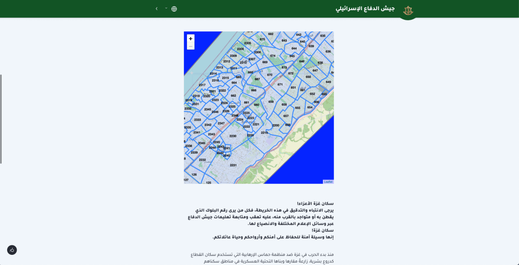
The first thing to note about the IDF’s interactive evacuation map (above) is that it uses open source tools, including notably Open Street Map background data. This is interesting because it’s generally known in the scholarly community that the IDF has extremely detailed high resolution data for the Gaza Strip. The first reason that comes for mind for why they didn’t use their data is simply because they didn’t want any aspect of their own data becoming public.
But even so, it’s notable they didn’t go with data form a commercial company, like Google which generally allow their data to be used for background maps for free with attribution, provided it’s non-commercial use–and technically this counts since the maps is available online without charge. If it were the case (I don’t know) that Google didn’t want to be associated with the Gaza evacuation map, then that would be notable because it suggests a possible shift in public perception. It could also be that the IDF didn’t want to risk any chance of annoying Google’s lawyers, even potentially.
Alternately, in my experience the Open Street Map data for military occupied and/or enclosed regions like the Gaza Strip tends to be better than the publicly available Google data, since Google not infrequently censors itself in line with the wishes of local governments, including military occupiers. So perhaps it was a question of the accuracy of what’s available, which is then ironic because the lower quality of the Google data would likely have been decided, in theory at least, years ago after consultation with the Israeli government as is routine (if at times, ethically questionable) around the world given that Google don’t want their maps to unintentionally break local laws. There is something saddening, if not entirely surprising, that the work of the employees and many volunteers and contributors at Open Street Map is being used for this.
So the first thing I checked was the source of the background data, and the second was for the possible reasoning behind the evacuation areas, how they might have been determined. The first notable thing here is that the areas themselves don’t directly conform to municipal or other more traditonal boundaries. They do sort of end up coinciding with major cities, which I’ll explain in a minute. But first it is notable that there’s little to no overlap with historic boundaries. In Palestinian-controlled areas there’s often a relatively high degree of dependency on pre-existing boundaries, especially British colonial boundaries. This is partly because Palestinian cartographers aren’t routinely given the opportunity or freedom of movement to construct and implement new boundaries and data. There are NGOs and some organizations affiliated with bodies like the United Nations and/or Palestinian Authority who have mapped and implemented updated boundaries and geographic features successfully, but it’s not easy and requires funding, time, significant labor capacity, and innovation on the part of the Palestinian technicians and cartographers.
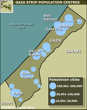
Because of this, colonial British maps of Palestine continue to look more relevant today than they otherwise would, given how much the landscape has changed since the British abandoned the region in 1948. You can see examples here, of village and/or municipal boundaries from a British map. Note Beit Hanoun, now in a Northern Gaza, which here appears halfway between the large font ‘Gaza’ near the top of the image and the smaller font ‘Gaza’ that indicates Gaza City:

Contemporary maps on the Palestinian side tend to use municipal boundaries that are essentially newer versions of the boundaries above, versions that have been updated to account for changes in population and built up area in the land area (now greatly and forcibly reduced by the Israeli government) of the Gaza Strip. To give just one example (note: the authors have no affiliation with me or my analysis. I got this off the internet, click image for the link.) Here Beit Hanoun is near the top right of the Gaza Strip:
Comparing this image to the Israeli evacuation map, it’s possible to see that the Israeli map has no regular correspondence to boundaries that would be meaningful to people on the ground.
That’s important, because it suggests that the evacuation areas weren’t determined by city, town, or even city block. Instead they were likely calculated from statistics for the region as a whole. If I had to guess–and again it’s just an educated guess from looking at the map–it looks like they probably used population density since the evacuation areas are smaller in the cities, which makes sense since there are more people per unit of area. They might, for example, calculate units that all roughly have equal population, then combine this with other (not publicly available) data somehow, and then fit the resulting units to the city streets, so that the calculated units don’t overlap and are roughly bounded by existing streets.

I don’t know if that’s the case, but just looking visually in comparison with population (NB: the BBC/Peace Now map at right is old, from 2005), it does seem like there’s probably some correlation between population and evacuation units.
Next, it’s important to note that the borders of the evacuation zones (the blue lines) on the map are suprisingly low resolution, far lower than the Open Street Map data that forms the background of the evacuation map, and that little to no effort has been made to make sure the blue lines make sense in terms of how they’d look on the ground. Generally the boundaries follow the streets, but there are also boundaries that cut across roads, at times dividing buildings from the same apartment complex in half or otherwise deviating from roads for reasons that don’t seem to have grounding in terms of the features of the landscape.
Here are some details from the evacuation map. These were taken on Sunday 3 Dec. 2023. The map is changing, and indeed it might be understandable if the map had been put together quickly and then refined later. However, to my knowledge these issues haven’t been updated as of this writing.
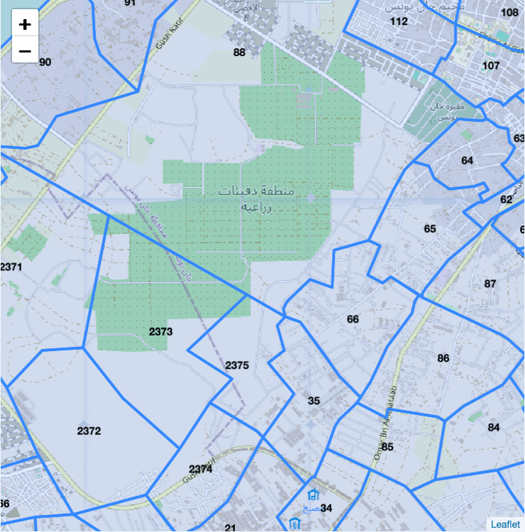
Look at area 2373, which cuts of 1/3 of an orchard, complexly cuts across the city boundary for Khan Younis, and contains no buildings. Similarly, 2372 and 2374 cut across streets, among them a curved road, in ways that would be nearly impossible to understand from a perspective on the gorund, and particularly in areas that have been devastated by bombing so that the division between street and building are no longer clear.
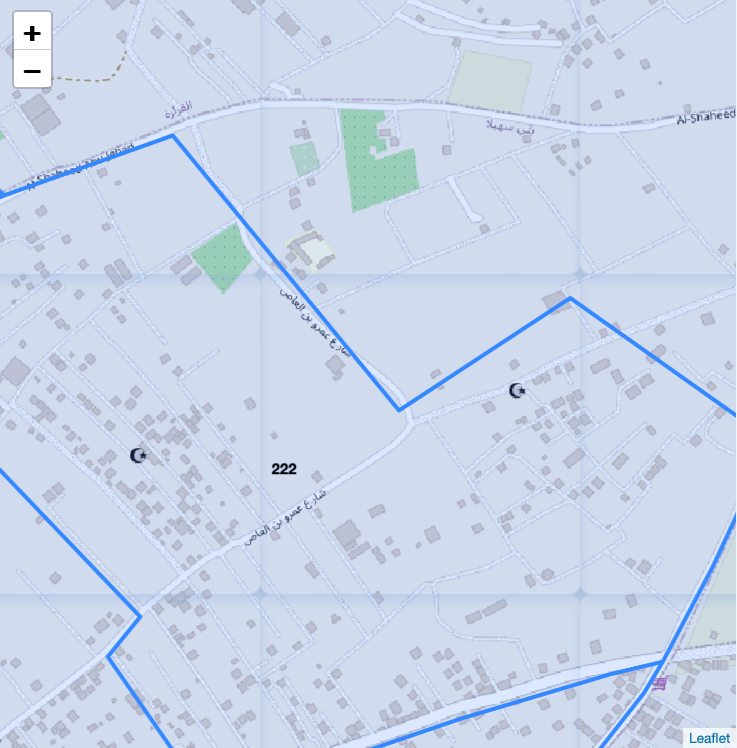
You live just northeast of the mosque, in the building where the blue boundary turns a corner near the middle right of the image. Half of your building is in area 222 and the other half is not. When do you evacuate?
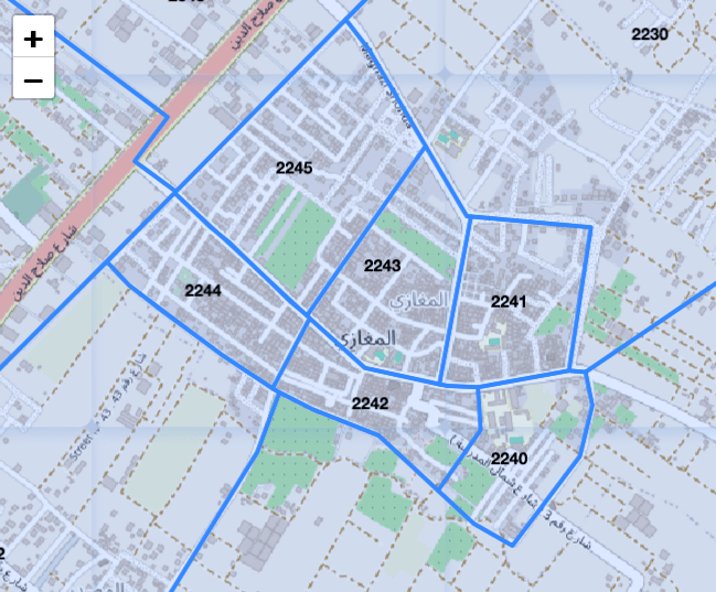
Even when the blue boundaries coincide with streets, this still creates a problem. You live in 2245 and are told to evacuate, but 2244 just below you is told to remain in place. Your main street on the southern edge of your area is divided down the middle by a blue boundary line. The street is on the boundary, so technically it could be in either 2245 or 2244, or both or neither. Is it ok to use that street to evacuate?
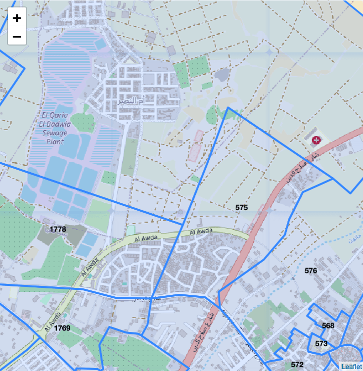
Don’t even get me started with this one. For example, 1778 cuts a sewage plant in half because…AI somehow? 575 cuts confusingly across buildings, paths, and roads. At one point, a small triangle of road is in 576 while the rest is in 575 and several other areas. The hospital at middle/top right is grouped with the sewage plant, hypothetically because the population of the hospital is a few hundred and the population of the top two-thirds of the sewage plant is zero…sigh.
All this is to say that this map has been publicized as a humanitarian effort on the part of the IDF to ensure the people of Gaza can evacuate. Let’s say that you were in Gaza and had electricity and internet sufficient to acess the map–which is not reported to be the case for the vast majority of people in Gaza right now–and also that you could zoom in far enough to find that your home—or wherever tent you’ve already been evacuated to, as is the case for many— was clearly located within a particular numbered blue region.
Even in that best case scenario, what the above makes clear, at least to me, is that this map is of very little use in actually figuring out where they think you are, and of no use at all in determining where you should go or how you should get there (remember: if a road is on a border, does that mean it’s safe or not?). This map is designed from above, using rough statistics and data despite the fact that the IDF is reported widely to have detailed statistics for every resident of Gaza and to be using this to algorithmically target strikes.
From what I can see here, in my opinion the map is humanitarian theater rather than a useful, operational document. It gives little to no thought to the people using it, and as such it wouldn’t actually help you get anywhere safe, if such a place even exists for Palestinians in Gaza, which sadly seems doubtful. And note, I’m only discussing the most accurate map the IDF released.
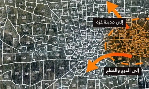
Most of the evacuation maps look like this monstrosity below, an orange hand-drawn area roughly laid over a blurry satellite photo with thick white lines for evacuation areas instead of blue ones, and numbers so small they’re mostly unreadable. What are people supposed to do with this apparent clip art genocide? The orange dotted line cuts through one of the (poorly defined) evacuation areas. The arrows point to multiple areas at once. The map is so rough you can’t even tell exactly which areas the arrows point to. Was this made in Microsoft Word? Apple Preview? It’s so roughly done, it’s hard to tell, and this from a military that claims to be one of the most technologically advanced in the world.
To close, two updates. One, when I went back to the map later in the weekend, the IDF had made three obvious changes. First, the Open Street Map attribution was gone (though Leaflet is also open source and uses OSM data). Second, the IDF masked off the areas around Gaza in blue, visually isolating Gaza from the Israeli residents that are very close by, e.g. in the bottom right corner of the image below:
Second, at least in all the browsers I’ve tried, they restricted the zoom level so that you can no longer zoom all the way out to the level of Gaza as a whole, as in the original image of the evacuation map I shared far above. Instead, as you might notice in the image immediately above, the minus sign is greyed out, meaning that this is the farthest out that you currently can zoom. What this does is make the map not only harder to use, but difficult for news outlets and outside observers to get a full overall picture of the evacuation area. In short: the map’s gotten worse. But that’s no surprise because, as far as I can tell from this outsider assessment, it apparently wasn’t designed for actual use.
Third and last, for cartographers and those who’d like to know more, a user on twitter (or whatever it’s called these days; NB: the user has no affiliation with me or this blog) has helpfully stripped and posted the data to the evacuation map. I haven’t had a chance to look at it in detail, but it’s sure to give up some insights as to how the data were made and what they contain, so the code is linked here.
